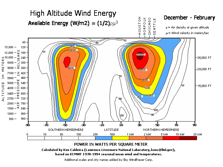
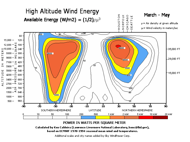
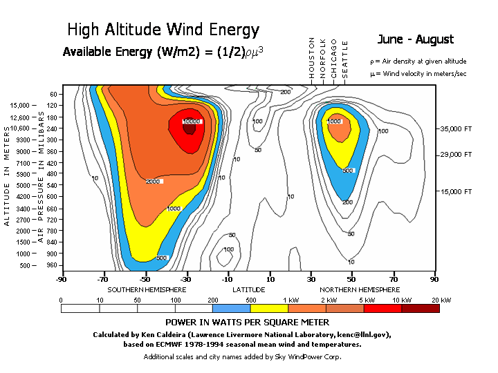
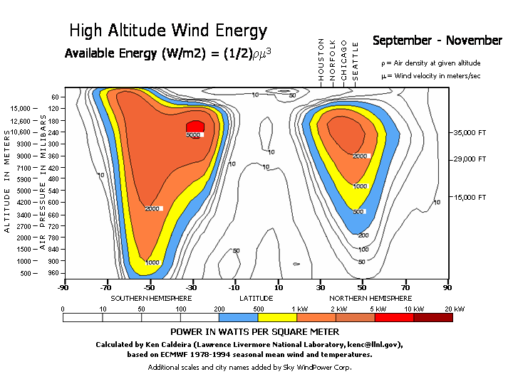
These charts are plotted by latitude and altitude, but not further divided by longitude. While longitude is relatively unimportant, there are differences. For example, high altitude wind energy over England is greater than its latitude might suggest. The capacity factor tables in a previous section, although calculated using a different time period base, provide some more detailed information.
The wind energy available in watts per square meter in a given color band is as shown in the legend, whose colors advance in logarithmic increments. The first four sections are shown as white because, except at near ground altitudes due to local topology, the wind power is insufficient for economic power generation.
Beginning with the blue color, operation may be economic some of the time. In yellow bands, operation should be marginally economic. For orange and above, FEGs will typically operate economically, the darker the color, the higher the capacity factor.
A site/altitude which is in an orange or darker band in all seasons should have a high capacity factor. For example, the Detroit/Chicago area with capacity factors of about ninety percent.
NOTE: The four graphs that follow are 90kb each, with a low bandwidth connection expect a couple of minutes for the files to fully display.


